Matterport: (Beta) Showcase 3.06116
Pages:
1

Frisco, Texas |
Metroplex360 private msg quote post Address this user | |
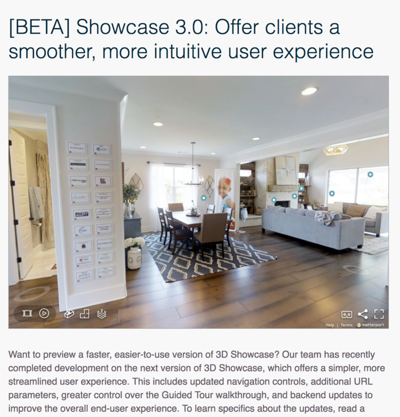
 Showcase v3.0.0.75 is now live. #1) Everyone can launch it from my.matterport.com on the models page. #2) The dollhouse fly-in has changed. It kinda hops in instead of gliding now. #3) You can now turn on / off floors during dollhouse mode. #4) The UGLY Black Bar at the bottom is now gone and the help / terms / matterport logo at the bottom are tiny. #5) The separate floorplan button from Showcase v1.0 makes its triumphant return. #6) The highlight reel, which was previously clunky - especially when compounded with the nasty black bar, has been redesigned in a manner that is elegant and more functional. #7) Default Transition Speed is faster now. Feels weird to me as the speed that I'm accustomed to from the past years feels very natural and the new speed feeds unnatural. #8) There is a survey available. Send feedback. |
||
| Post 1 • IP flag post | ||

|
Matt19 private msg quote post Address this user | |
| I just tried it. It misplaced my matter tag. I'm guessing they are working on the bugs. | ||
| Post 2 • IP flag post | ||
 Fast Start Fast Start Websites Peterborough, United Kingdom |
angusnorriss private msg quote post Address this user | |
| Is there a link to share to try on mobile? | ||
| Post 3 • IP flag post | ||

Frisco, Texas |
Metroplex360 private msg quote post Address this user | |
Quote:Originally Posted by angusnorriss Login via my.matterport.com via mobile to authenticate, then you can access the links via my.matteport.com, or access any saved bookmarks you may have made to the new showcase. Important thing is that it requires being authenticated while in beta. |
||
| Post 4 • IP flag post | ||
 Fast Start Fast Start Websites Peterborough, United Kingdom |
angusnorriss private msg quote post Address this user | |
| Much appreciated! | ||
| Post 5 • IP flag post | ||

|
Shakoure private msg quote post Address this user | |
| The navigation ring is a bit smaller, which is good. So are the smaller icons. But I really didn't see much of a difference in the transitions or movements from one area to another, much less any improvement in the imaging of the space. What I would like to see, however, are smaller Mattertag icons. Sometimes, depending on proximity or viewing distance, they cover a huge amount of space or portions of furnishing that the viewer is looking at. Maybe the best improvements are hidden in the back-end. |
||
| Post 6 • IP flag post | ||
Pages:
1This topic is archived. Start new topic?


