


Matterport: Terms / Help Line adds Clutter.5559
Pages:
1

Frisco, Texas |
Metroplex360 private msg quote post Address this user | |
| Hi All, In reviewing the recent series of video lessons from Matterport, I made a startling discovery. Matterport is cropping off the terms/help bar at times during a video presentation. See at 50s (WGA embeds do not support the &t=50s parameter): 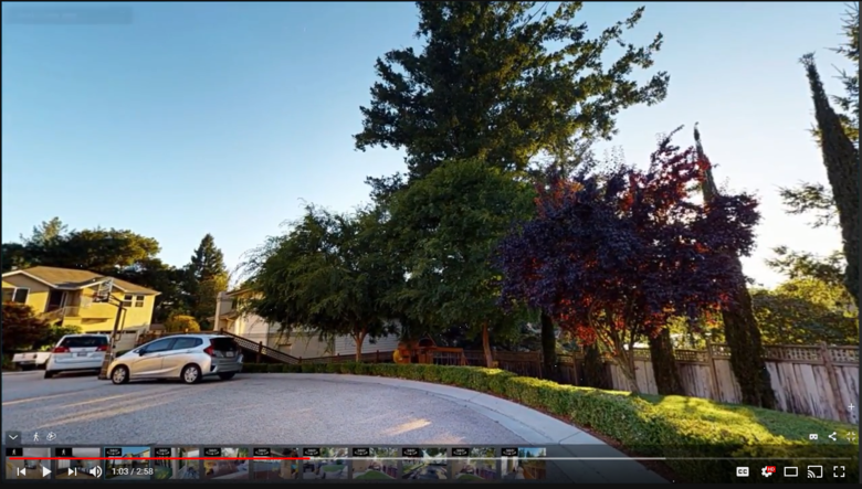 This is significant for me because I believe this is validation that that Terms / Help line is intrusive and distracting. In my dream world of UI / UX enhancements, I would prefer the help link to be an icon between the share button and the full screen button. I'd prefer that the terms of service appear on the 'Play' screen, during the loading screen, and then disappear and not reappear until the VR modal appears, the Share modal appears, or the Help modal appears. (Modal = Floating information window). What do you think? |
||
| Post 1 • IP flag post | ||
|
|
yoon2366 private msg quote post Address this user | |
| I agree 100% with you. Terms/help line should be an icon instead of a line. | ||
| Post 2 • IP flag post | ||

Orange, California |
craigsauer private msg quote post Address this user | |
| Yes! A thousand times yes! | ||
| Post 3 • IP flag post | ||
Pages:
1This topic is archived. Start new topic?